
For this project, I created a logo for the WSU Badminton Club. As training occurs in the badminton club, it makes sense to create a logo for the club in order to make the club easily identified.
My design is highly influenced by the Illustrator tutorials; varsity lettering and fist logo.
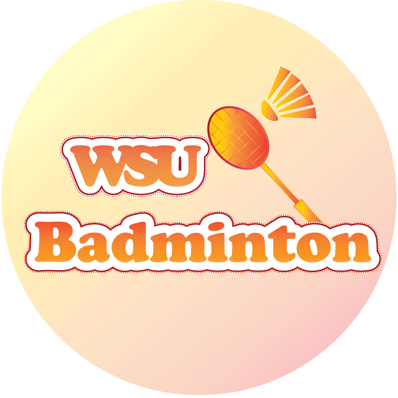
The shuttle and racket are significant elements of the design. The two objects are the main items used to play badminton. Thus, including allows the logo to be not dull and related to my topic.
To create the shuttle, I used rectangle tool and ellipse tool. In order to create the semicircle shape, I used the curvature tool and moved the very bottom anchor towards the middle The feathers were made by moving the anchors on the rectangle and changing it to a trapezium. The different elements were then move and grouped together to represent a shuttle. Similar steps were used to create the racket .
The words were created using the text tool and joined together by kerning. The text had an orange fill over an orange, yellow gradient which was crystallized using the pixelate effect. The deep red border and dotted border was added by adding a stroke and setting the path to offset. As I wanted the words to be uniform and readable, I used the same font for both words and kept the colour and layout the same for unity.
I then changed the color of the shuttle and racket to the orange and yellow gradient after deciding on the color of my text. The gradient of the racket’s frame was changed from linear to radial.
A square was drawn to cover the entire document and colored using the yellow and orange gradient. However, I did not want the background to have a high saturation, therefore I reduced the opacity of the layer to around 50%. This creates a balance and allowed my main elements to pop.
I did not encounter any technical difficulties as I used elements that were being taught in the Illustrator tutorials. The font that I used in built in the Illustrator app.

Hi Fang Yu,
I think your logo is amazing at first glance it catches my eye and I am interested to know more about it instantly, the colors your used are perfect they pop everything in the right way. I think something that would be creative is to see if you could make the overall circle logo in the print of a badminton I think it would make the logo bold. I would even say you could add text to that says “club” so by some people reading it they could have more interest into and in wanting more information on WSU badminton. Overall your logo is great and I think it would be perfect for a club to use professionally.
LikeLike
Fang Yu,
I really like simplicity of your blog. It’s simple yet very professional. The colors you have chosen for your logo design blends very well together and stands out very well. Some things I would like to recommend to make your logo design even better is add “club” in your text, this way you can also recruit more players to join. Overall, I think your logo design is well-detailed and fits perfectly with your blog. The colors make your design pop even more.
LikeLike
I feel that I brought out the main elements of the badminton club clearly and had different layers of colors which fits in well with each other. However, I feel that the ratio of the shuttle looks weird and I want to try to readjust the ratio and size. The ratio of the images and words also seem slightly weird. I think I could play around and try to make the ratio better and allow the images to pop more.
LikeLike