Audio Story Draft

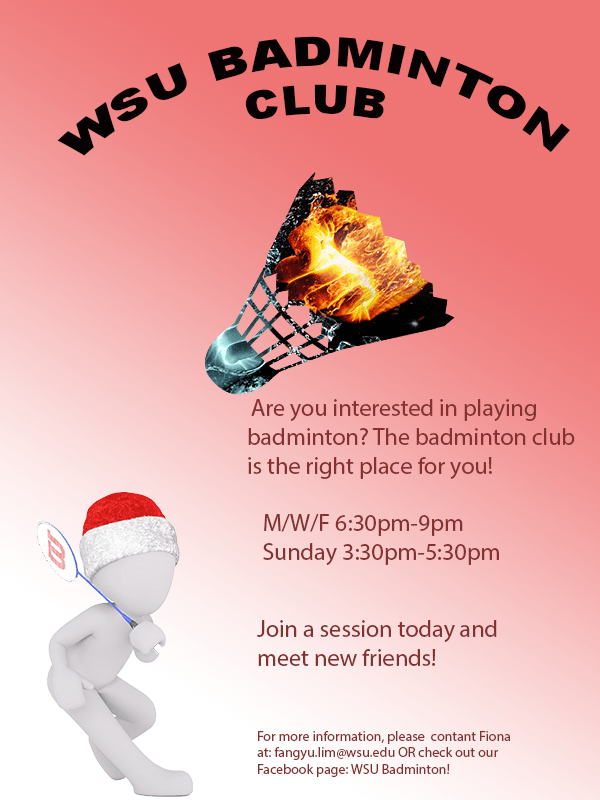
For this project, I created an audio story interviewing badminton club members from different countries and how they carried out training in their country. My course topic is badminton training. As badminton training can be carried out in various ways, it is interesting to know how badminton training can differ in different countries. Based on my experience, there are two types of training; professional and recreational. Personally, I have trained for recreational purpose previously. These badminton club members which I have interviewed have trained to participate in tournaments and it is interesting to see the difference in level of difficulty.

The idea for this project who thought of after going through the list of examples given on the course content page. I wanted to do an interview and I knew that many of the badminton club members come from different countries and have trained for tournaments previously. Therefore, I thought that it would be interesting to interview them and see the difference in training methods from different countries.

Currently, I do not have any ambient sounds or background noise elimination, but I am hoping to record sounds of badminton shuttles being hit and including it in my audio story.

I recorded all the audio records using a smartphone and sent it over to my computer to edit it. I created a new multitrack session and included all the audio files that I record and cut out parts with long pauses of phrases such as “umm” and “like…” using the razor tool. I also used the zoom in and out tool for both amplitude and time to get a clearer view of the cutting points and to decrease the volume of the audio so that it is not overwhelming. As there were many cuts in one audio, I used the tool under effect :match loudness” to make everything cohesive.

I did not encounter any technical challenges in this part of the project as I was using skills taught in the audition tutorial. However, I think that there is the probability of running into technical challenges once I try to incorporate more effects. For people who encounter technical challenges, I would suggest to check out the audition tutorials or search online for audition tool help.
All the materials using in my project was created by myself.


Raw Audio Footage

In this audio story I plan to tell the different routines of how people train badminton in different countries by interviewing people from the badminton club. These members come from different countries and have had a fair amount of experience with professional training.

Final Logo Design

For this project, I created a logo for the WSU Badminton Club. As training occurs in the badminton club, it makes sense to create a logo for the club in order to make the club easily identified. My design is highly influenced by the Illustrator tutorials; varsity lettering and fist logo. The shuttle and racket are significant elements of the design. The two objects are the main items used to play badminton. Thus, including allows the logo to be not dull and related to my topic.

To create the shuttle, I used rectangle tool and ellipse tool. In order to create the semicircle shape, I used the curvature tool and moved the very bottom anchor towards the middle The feathers were made by moving the anchors on the rectangle and changing it to a trapezium. The different elements were then move and grouped together to represent a shuttle. Similar steps were used to create the racket .

The words were created using the text tool and joined together by kerning. The text had an orange fill over an orange, yellow gradient which was crystallized using the pixelate effect. The deep red border and dotted border was added by adding a stroke and setting the path to offset. As I wanted the words to be uniform and readable, I used the same font for both words and kept the color and layout the same for unity.

I then changed the color of the shuttle and racket to the orange and yellow gradient after deciding on the color of my text. The gradient of the racket’s frame was changed from linear to radial.

A square was drawn to cover the entire document and colored using the yellow and orange gradient. However, I did not want the background to have a high saturation, therefore I reduced the opacity of the layer to around 50%. This creates a balance and allowed my main elements to pop.

The same suggestion that I got from my feedback was the add the word “club” into the logo which would allow people who saw the logo to clearly identify what the logo is for. The other feedback that I got was an idea to change the overall shape of the logo to the shape of a shuttle. These two feedback made me realize the importance of adding the word “club” and therefore, I added the text in the logo. However, I did not take in the idea of changing the overall shape of the logo. I thought that it was a cool idea. However, I have already included a badminton shuttle in the logo and I think it would be too much to make the background the shape of a shuttle too. Therefore, I kept the shape of the logo the same.

I did not encounter any technical difficulties as I used elements that were being taught in the Illustrator tutorials. The font that I used in built in the Illustrator app. I would encourage anyone that faced problems to search on the internet for techniques that they can use as there are many resources available.

Logo Draft

For this project, I created a logo for the WSU Badminton Club. As training occurs in the badminton club, it makes sense to create a logo for the club in order to make the club easily identified.
My design is highly influenced by the Illustrator tutorials; varsity lettering and fist logo.
The shuttle and racket are significant elements of the design. The two objects are the main items used to play badminton. Thus, including allows the logo to be not dull and related to my topic.
To create the shuttle, I used rectangle tool and ellipse tool. In order to create the semicircle shape, I used the curvature tool and moved the very bottom anchor towards the middle The feathers were made by moving the anchors on the rectangle and changing it to a trapezium. The different elements were then move and grouped together to represent a shuttle. Similar steps were used to create the racket .

The words were created using the text tool and joined together by kerning. The text had an orange fill over an orange, yellow gradient which was crystallized using the pixelate effect. The deep red border and dotted border was added by adding a stroke and setting the path to offset. As I wanted the words to be uniform and readable, I used the same font for both words and kept the colour and layout the same for unity.

I then changed the color of the shuttle and racket to the orange and yellow gradient after deciding on the color of my text. The gradient of the racket’s frame was changed from linear to radial.

A square was drawn to cover the entire document and colored using the yellow and orange gradient. However, I did not want the background to have a high saturation, therefore I reduced the opacity of the layer to around 50%. This creates a balance and allowed my main elements to pop.

I did not encounter any technical difficulties as I used elements that were being taught in the Illustrator tutorials. The font that I used in built in the Illustrator app.

Logo Project Sketch

This is the initial idea of the logo created for the WSU badminton club. The elements used are highly affected by the illustrator tutorial. As I am fairly unfamiliar with Illustrator, it worries me that I would not be able to create a logo using other elements which I did not learn. Therefore, I incorporated different elements from the tutorial which could be possible to bring out the important elements of the badminton club; the name, racquet and shuttle.

Illustrator Tutorial

Here are the five completed images of my Illustrator tutorial. I felt that it was more challenging and difficult to use Illustrator compared to Photoshop. However, it seems to be more useful when creating original contents or logos.

Final Graphic Design Project

For the graphic design project, I created a brochure which promotes people to join the WSU badminton club. as my topic is badminton training and this starts with joining a club. It is also more interesting when more people train together. Therefore, I hope by creating a brochure for the badminton club, it can inform more people about the club and join.
The pattern on the badminton shuttlecock was inspired by one of the photoshop tutorials which used the tool “clipping mask”, it allows the user to overlap images and change the color or background of the other. I wanted to include the shuttlecock as it is one of the most important elements of playing badminton, however, I did not want it to be plain and boring. Therefore, I used my knowledge gained from the photoshop tutorial to create a badminton shuttle with the pattern of a blue and orange fist, giving it a sense of competition. The pattern was originally a more cool-toned color. However, after reading comments given by my classmates, I realized the need for cohesion in color. The figure playing badminton was fairly warm tone and yet the shuttle was very cool tone. Therefore, I adjusted the hue and saturation of the orange and blue fist to make the red color pop up. The person with playing badminton was meant to add more content to the brochure and not let it be plain and boring.

To create this poster, I started with a blank canvas of 600(w) x (800)(h) with the RGB color mode. Next, I opened the picture of the character holding a racquet and cropped it out using the Quick Selection tool in Photoshop and created a layer via copy and saved it as a .png file so it does not have any backgrounds. I started off using the gradient tool to create a blue gradient background and later changed to a red background as I felt that blue would not pass on a strong feeling to the audience. However, after reading comments from my classmates, I felt the need to include a photo taken by myself regarding badminton as it will allow the audience to better relate to my topic. I had the captions “WSU Badminton Club” written using the text tool and used the function Warp Text to make it an arch shape. In my revised version, I kept it the same but I changed the font size of my text so it can be better read. I also changed the color from black to red to better fit the overall color. I then used the place embedded function to add pictures of the character and the shuttlecock. I then placed the embedded picture of the blue and orange fist and made sure that it covered the whole shuttle and was in the proportion that I wanted. After making, I used the clipping mask tool thus, only the portion that was covering the shuttlecock remained. I also changed the arrangements and color of my text to not let the text be so formal and rigid but still visible. Lastly, I used the saturation and hue function to allow the overall color scheme of the brochure to be red and cohesive.

All elements were created by searching on a website which allowed usage of pictures using the keyword badminton. I saved a few pictures that created ideas. The project was started from scratch using Adobe Photoshop. The different tools in photoshop allow users to create different layers and create a more intense effect. For a new user, it may be challenging to find the tools that you want to use to create a certain technique. To solve this problem, you can only play more with the tools and watch tutorials online. 

The few links below are the sources where I got the images which I used in my brochure. The content on Pixabay may be used for free for commercial and noncommercial unless stated. 
1. The orange and blue fist
https://pixabay.com/illustrations/fire-and-water-fight-hands-fire-2354583/
2. The shuttlecock
https://pixabay.com/vectors/badminton-shuttlecock-game-play-1292971/
3.The character holding a racquet
https://pixabay.com/illustrations/white-male-isolated-3d-model-1748807/

Badminton Club Brochure Draft(Graphic Design Project)

For the graphic design project, I decided to create a brochure which promotes people to join the WSU badminton club. As my topic is badminton training, the start of the training was to join a badminton club. It is also more interesting when more people train together. Therefore, my decision was to create a brochure for the badminton club, hoping to inform more people about the club. The pattern on the badminton shuttlecock was inspired by one of the photoshop tutorial. I wanted to include a shuttlecock as it is one of the most important item when you play badminton. However, I did not want it to be plain and boring. Thus, I used the tool “clipping mask” to create a badminton shuttle with the patten of a blue and orange fist, giving the feeling of a competition. The person holding a badminton racquet represents someone playing badminton, adding more interesting elements to the poster and lot it be dull. The gradient background is heading towards the person at the same direction as the shuttlecock is.

To create this poster, I started off with a blank canvas of 600(w) x (800)(h) with the RGB color mode. Next, I opened the picture of the character holding a racquet and cropped it out using the Quick Selection tool in Photoshop and created a layer via copy and saved it as a .png file so it does not have any backgrounds. On the original file with the background, I used the Gradient tool to create a gradient background. I originally thought of using a pale blue as the background. However, I felt that it would not pass on a strong feeling to the audience

To create this poster, I started off with a blank canvas of 600(w) x (800) (h) with the RGB color mode. Next, I opened the picture of the character holding a racquet and cropped it out using the Quick Selection tool in Photoshop and created a layer via copy and saved it as a .png file so it does not have any backgrounds. On the original file with the background, I used the Gradient tool to create a gradient background. I originally thought of using a pale blue as the background. However, I felt that it would not pass on a strong feeling to the audience and chose a red background. Next, I added a new layer and changed the hue and saturation to allow for the background to be more vibrant. I then wrote the captions “WSU Badminton club” using the text tool and made it an arch shape by using the function Warp Text. I then used the function place embedded to add the pictures of the character and the shuttlecock. When I placed the embedded picture of the blue and orange fist, I made sure that it covered the whole shuttle and was in the proportion that I wanted. After making sure, I used the function clipping mask, thus, only the portion that was covering the shuttlecock remained. I then used the text function to add information and the color wheel to change the color of the text.

All elements were created by searching on website which allowed usage of pictures using the key word badminton. I saved a few pictures that created ideas. The project was start from scratch using Adobe Photoshop. The different tools in photoshop allows users to create different layers and create a more intense effect. For a new user, it may be challenging to find the tools that you want to use to create a certain technique. To solve this problem, you can only play more with the tools and watch tutorials online.

The few links below are the sources where I got the images which I used in my brochure. The content on Pixabay may be used for free for commercial and noncommercial unless stated.
1. The orange and blue fist
https://pixabay.com/illustrations/fire-and-water-fight-hands-fire-2354583/
2. The shuttlecock
https://pixabay.com/vectors/badminton-shuttlecock-game-play-1292971/
3.The character holding a racquet
https://pixabay.com/illustrations/white-male-isolated-3d-model-1748807/


Image Collection

This is an image of my own racquets which I took myself. For this project, I am thinking of creating a brochure that invites people to join a badminton club.

For the three images obtained from the website Pixabay, the website states that
” ✓ All content on Pixabay can be used for free for commercial and noncommercial use across print and digital, except in the cases mentioned in “What is not allowed”.
✓ Attribution is not required. Giving credit to the contributor or Pixabay is not necessary but is always appreciated by our community.
✓ You can make modifications to content from Pixabay.”
https://pixabay.com/service/license/

This image was obtained from Pixabay (https://pixabay.com/illustrations/fire-and-water-fight-hands-fire-2354583/)
Image obtained from https://pixabay.com/vectors/badminton-shuttlecock-game-play-1292971/.
Image obtained from https://pixabay.com/illustrations/white-male-isolated-3d-model-1748807/

Blog at WordPress.com.

Up ↑

Design a site like this with WordPress.com
Get started