
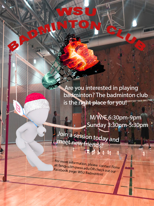
For the graphic design project, I created a brochure which promotes people to join the WSU badminton club. as my topic is badminton training and this starts with joining a club. It is also more interesting when more people train together. Therefore, I hope by creating a brochure for the badminton club, it can inform more people about the club and join.
The pattern on the badminton shuttlecock was inspired by one of the photoshop tutorials which used the tool “clipping mask”, it allows the user to overlap images and change the color or background of the other. I wanted to include the shuttlecock as it is one of the most important elements of playing badminton, however, I did not want it to be plain and boring. Therefore, I used my knowledge gained from the photoshop tutorial to create a badminton shuttle with the pattern of a blue and orange fist, giving it a sense of competition. The pattern was originally a more cool-toned color. However, after reading comments given by my classmates, I realized the need for cohesion in color. The figure playing badminton was fairly warm tone and yet the shuttle was very cool tone. Therefore, I adjusted the hue and saturation of the orange and blue fist to make the red color pop up. The person with playing badminton was meant to add more content to the brochure and not let it be plain and boring.
To create this poster, I started with a blank canvas of 600(w) x (800)(h) with the RGB color mode. Next, I opened the picture of the character holding a racquet and cropped it out using the Quick Selection tool in Photoshop and created a layer via copy and saved it as a .png file so it does not have any backgrounds. I started off using the gradient tool to create a blue gradient background and later changed to a red background as I felt that blue would not pass on a strong feeling to the audience. However, after reading comments from my classmates, I felt the need to include a photo taken by myself regarding badminton as it will allow the audience to better relate to my topic. I had the captions “WSU Badminton Club” written using the text tool and used the function Warp Text to make it an arch shape. In my revised version, I kept it the same but I changed the font size of my text so it can be better read. I also changed the color from black to red to better fit the overall color. I then used the place embedded function to add pictures of the character and the shuttlecock. I then placed the embedded picture of the blue and orange fist and made sure that it covered the whole shuttle and was in the proportion that I wanted. After making, I used the clipping mask tool thus, only the portion that was covering the shuttlecock remained. I also changed the arrangements and color of my text to not let the text be so formal and rigid but still visible. Lastly, I used the saturation and hue function to allow the overall color scheme of the brochure to be red and cohesive.
All elements were created by searching on a website which allowed usage of pictures using the keyword badminton. I saved a few pictures that created ideas. The project was started from scratch using Adobe Photoshop. The different tools in photoshop allow users to create different layers and create a more intense effect. For a new user, it may be challenging to find the tools that you want to use to create a certain technique. To solve this problem, you can only play more with the tools and watch tutorials online.
The few links below are the sources where I got the images which I used in my brochure. The content on Pixabay may be used for free for commercial and noncommercial unless stated.
1. The orange and blue fist
https://pixabay.com/illustrations/fire-and-water-fight-hands-fire-2354583/
2. The shuttlecock
https://pixabay.com/vectors/badminton-shuttlecock-game-play-1292971/
3.The character holding a racquet
https://pixabay.com/illustrations/white-male-isolated-3d-model-1748807/

Leave a comment