")
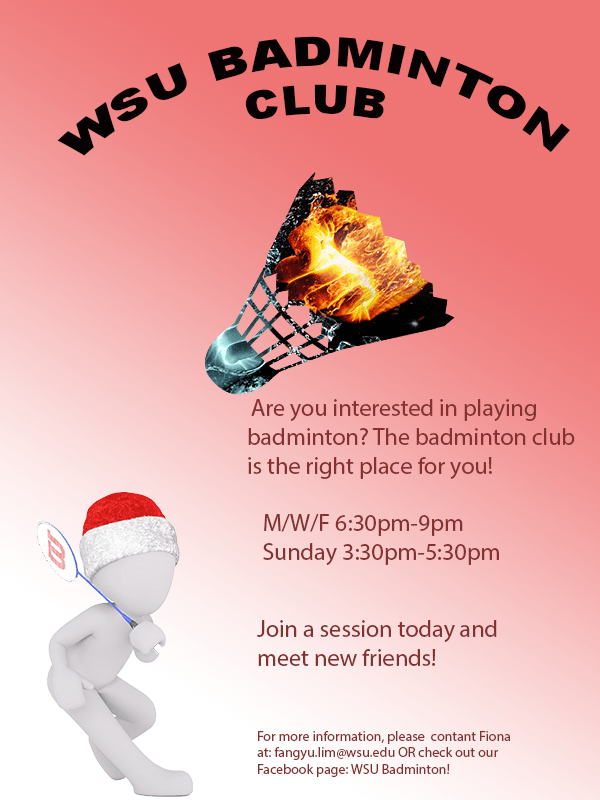
For the graphic design project, I decided to create a brochure which promotes people to join the WSU badminton club. As my topic is badminton training, the start of the training was to join a badminton club. It is also more interesting when more people train together. Therefore, my decision was to create a brochure for the badminton club, hoping to inform more people about the club. The pattern on the badminton shuttlecock was inspired by one of the photoshop tutorial. I wanted to include a shuttlecock as it is one of the most important item when you play badminton. However, I did not want it to be plain and boring. Thus, I used the tool “clipping mask” to create a badminton shuttle with the patten of a blue and orange fist, giving the feeling of a competition. The person holding a badminton racquet represents someone playing badminton, adding more interesting elements to the poster and lot it be dull. The gradient background is heading towards the person at the same direction as the shuttlecock is.
To create this poster, I started off with a blank canvas of 600(w) x (800)(h) with the RGB color mode. Next, I opened the picture of the character holding a racquet and cropped it out using the Quick Selection tool in Photoshop and created a layer via copy and saved it as a .png file so it does not have any backgrounds. On the original file with the background, I used the Gradient tool to create a gradient background. I originally thought of using a pale blue as the background. However, I felt that it would not pass on a strong feeling to the audience
To create this poster, I started off with a blank canvas of 600(w) x (800) (h) with the RGB color mode. Next, I opened the picture of the character holding a racquet and cropped it out using the Quick Selection tool in Photoshop and created a layer via copy and saved it as a .png file so it does not have any backgrounds. On the original file with the background, I used the Gradient tool to create a gradient background. I originally thought of using a pale blue as the background. However, I felt that it would not pass on a strong feeling to the audience and chose a red background. Next, I added a new layer and changed the hue and saturation to allow for the background to be more vibrant. I then wrote the captions “WSU Badminton club” using the text tool and made it an arch shape by using the function Warp Text. I then used the function place embedded to add the pictures of the character and the shuttlecock. When I placed the embedded picture of the blue and orange fist, I made sure that it covered the whole shuttle and was in the proportion that I wanted. After making sure, I used the function clipping mask, thus, only the portion that was covering the shuttlecock remained. I then used the text function to add information and the color wheel to change the color of the text.
All elements were created by searching on website which allowed usage of pictures using the key word badminton. I saved a few pictures that created ideas. The project was start from scratch using Adobe Photoshop. The different tools in photoshop allows users to create different layers and create a more intense effect. For a new user, it may be challenging to find the tools that you want to use to create a certain technique. To solve this problem, you can only play more with the tools and watch tutorials online.
The few links below are the sources where I got the images which I used in my brochure. The content on Pixabay may be used for free for commercial and noncommercial unless stated.
1. The orange and blue fist
https://pixabay.com/illustrations/fire-and-water-fight-hands-fire-2354583/
2. The shuttlecock
https://pixabay.com/vectors/badminton-shuttlecock-game-play-1292971/
3.The character holding a racquet
https://pixabay.com/illustrations/white-male-isolated-3d-model-1748807/

I really like your brochure! It shows your interest, it i interesting to look at, it is eye catching, and provides information. I really like this idea because it means something to you and is cool. 2 suggestions i have for improvement are to add a background that is a picture that is meaning to you. I think doing this will just add more and add more of your interest. Another suggestion i have for improvement is to maybe add a picture that you took or of you playing. I think this will again, add more personality to it about you and add more meaning! I do however love it as it is and am intrigued by it. I think you did a great job int he writing portion. That part is strong because you explained well as to why you did what you did. Good job!!! I really like this and keep it up!
LikeLike
I find your graphic design project really unique and original! For this particular topic of badminton I think making a brochure is really smart and logical. One suggestion I have is adding more pictures that connect and relate to your topic. This will help demonstrate what you are trying to express to the viewers. Adding more pictures of badminton will also be helpful so people can visualize what you are presenting. Another thing that may be effective for your graphic design is possibly switching up text fonts and colors. By doing this it may draw more attention to your brochure. Colors can have a huge impact on the eye so adding some more color schemes can really give it a more eye catching look that may draw more people in. Overall I love the look of the brochure you did an awesome job spreading pictures and texts out, making everything look spaced out in an effective way.
LikeLike
The envision of a brochure came across very nicely in this draft! It clearly looks like a brochure when you first glance at it, it is very informational and gives a clear understanding of your topic for the year. The use of photoshop with the images is impressive and not overwhelming to the brochure. One thing I would suggest is to have the pictures be more similar rather than having opposite effects on each other. One of the images is white and cold while the other is on fire and dark. I feel as though cohesive images will make the brochure more visually appealing. Another thing you could do is spread the paragraphs out on different places of the brochure, so it doesn’t look so formatted and formal. Other than that, your use of the photoshop tools is great and you could even do more with it to make it even more uniwue and trendy.
LikeLike